Ladina Wasescha
Armor – There when it counts
2024 ⋅ Corporate Design
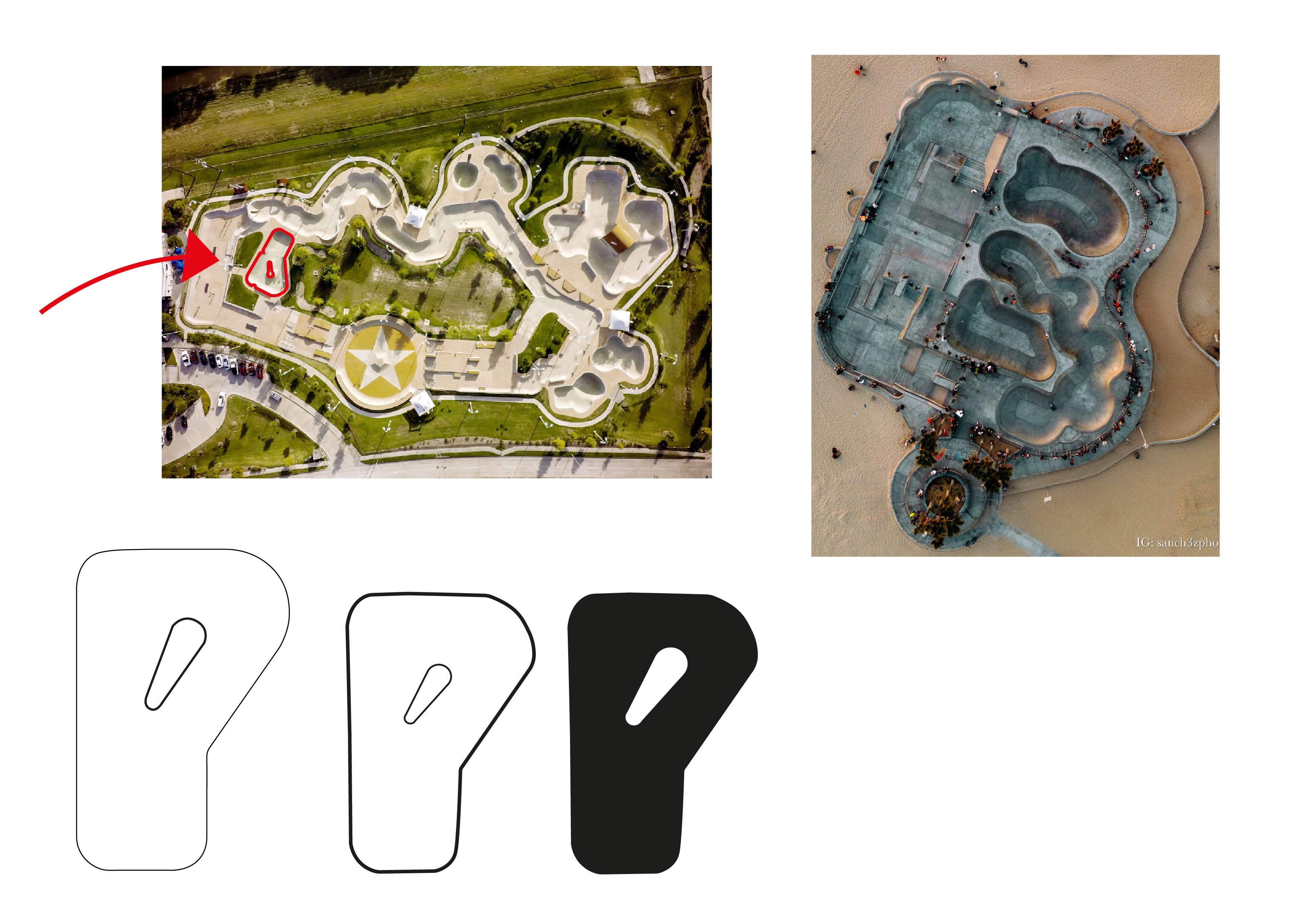
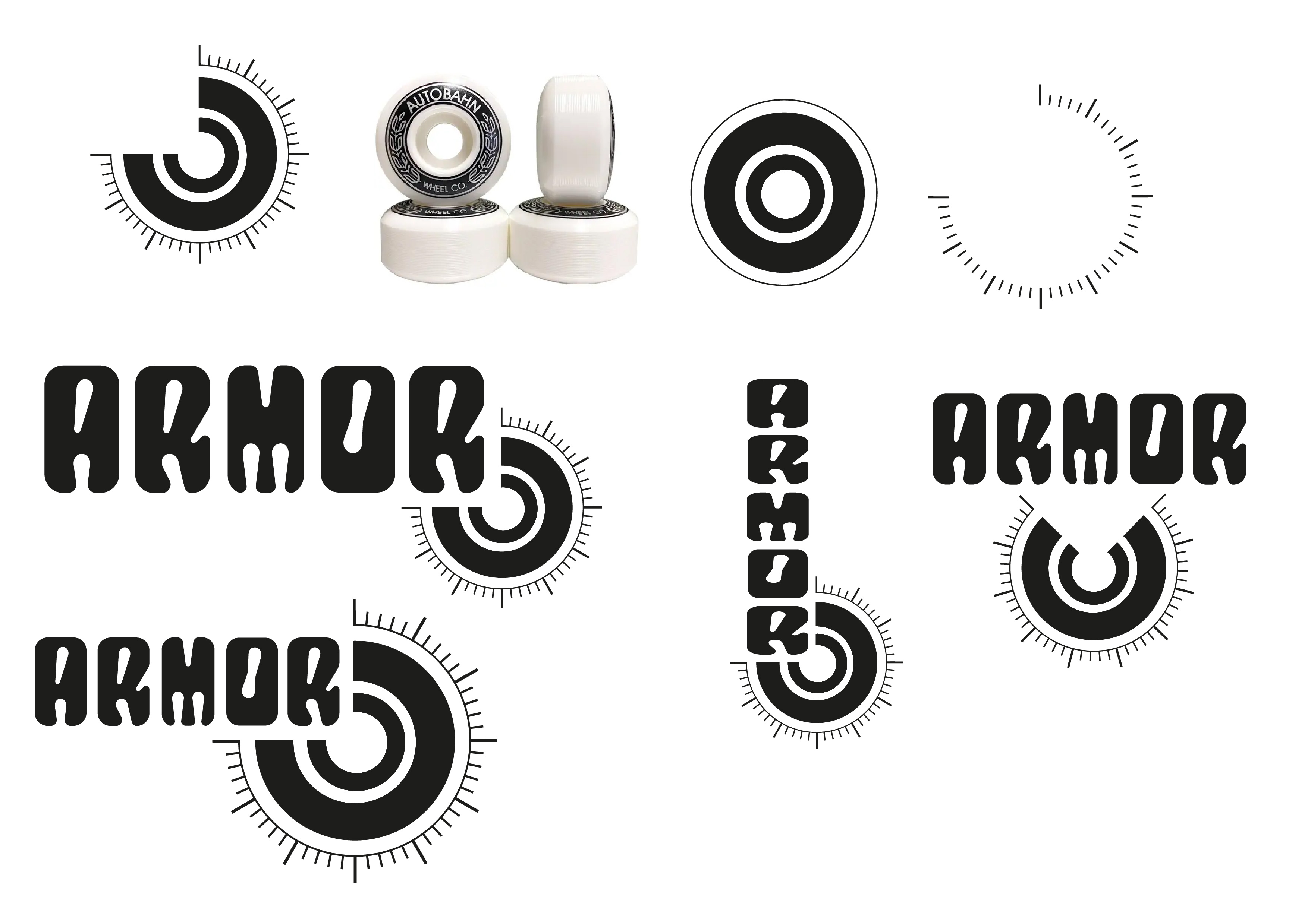
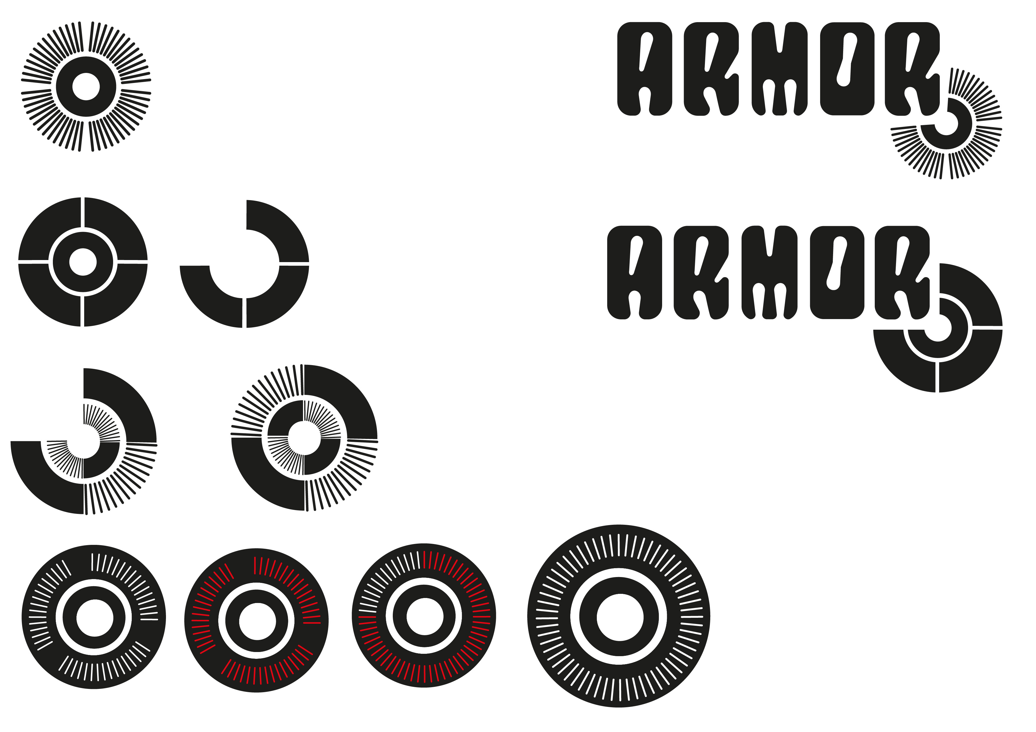
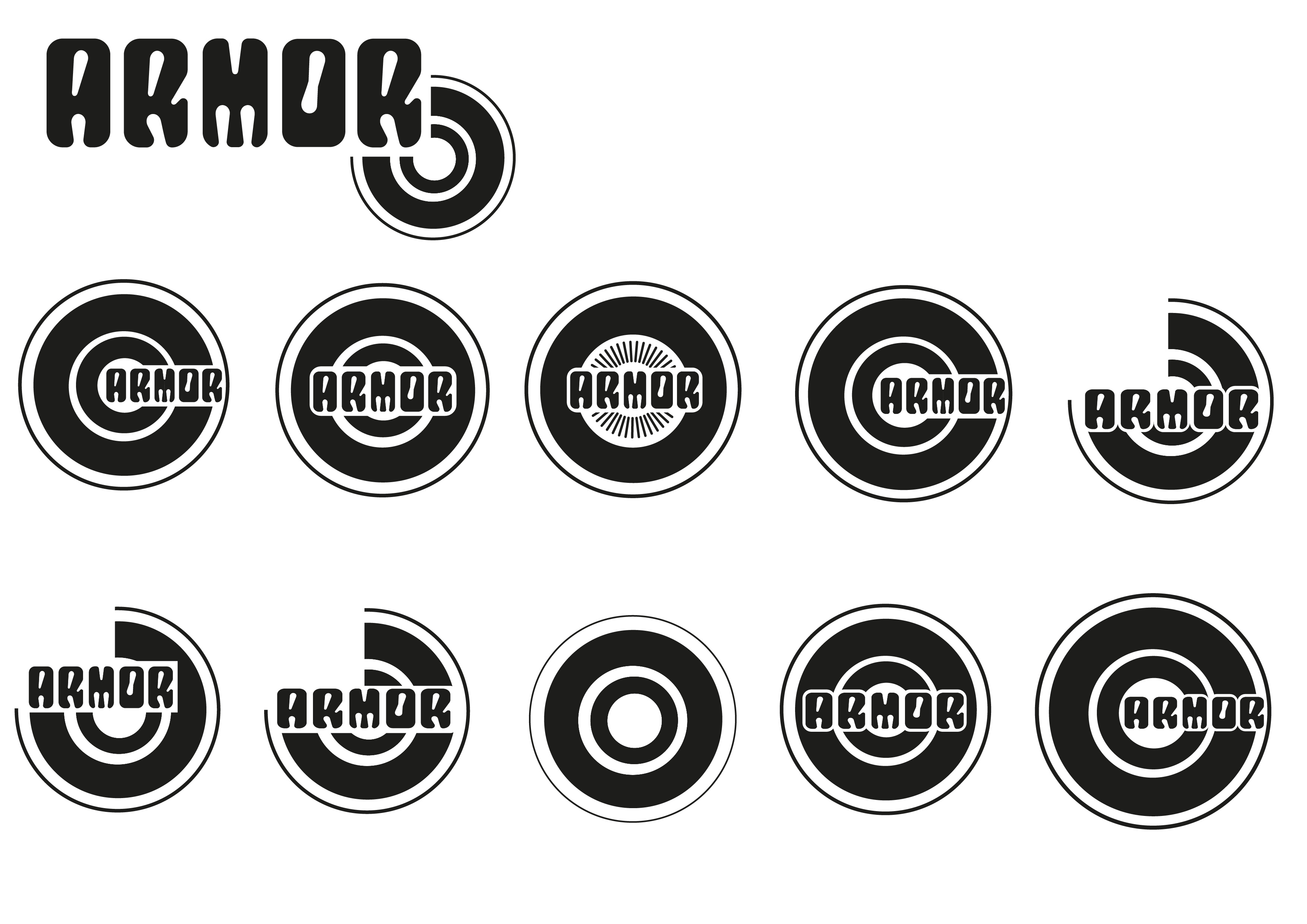
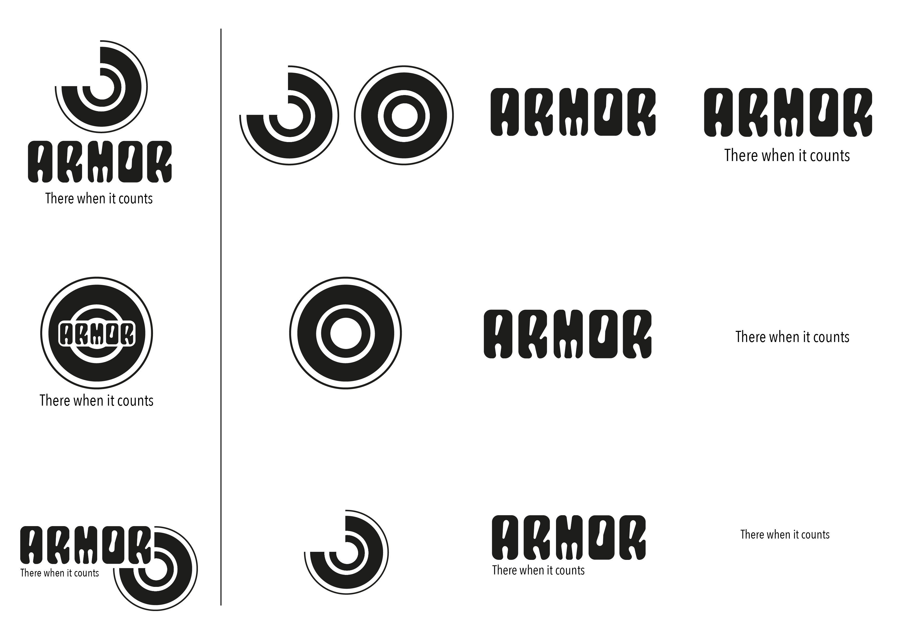
This project presents a combination mark for a fictional brand that designs skate protective gear for the Olympics. It is inspired by the aerial view of a skate park, with its rounded, organic, and geometric elements reflected in the typography. The symbol takes inspiration from an analogue clock, skateboard wheels, and movement itself. Curves and circles characterise the design and symbolise infinity – a representation of the brand’s durable, enduring quality.

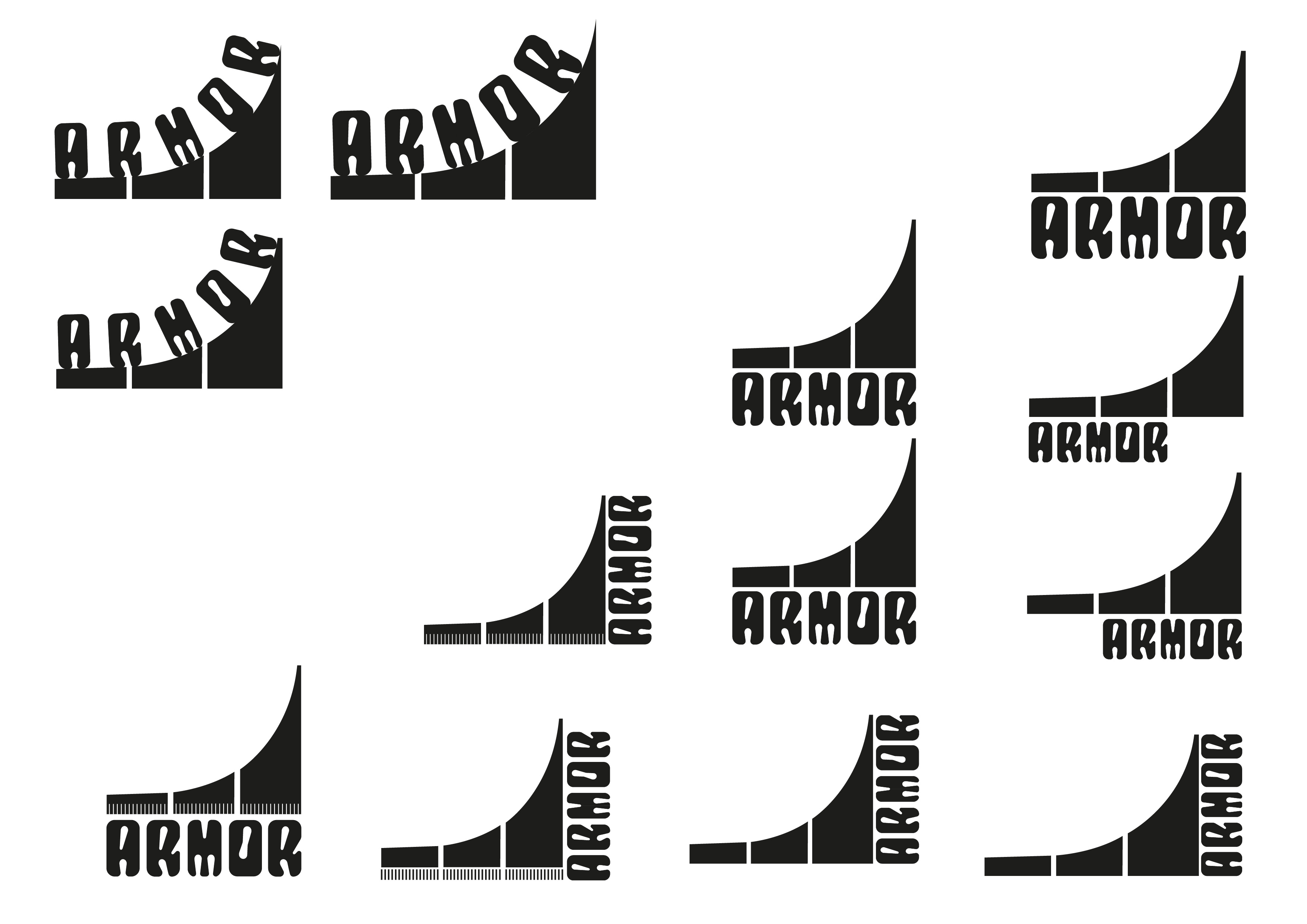
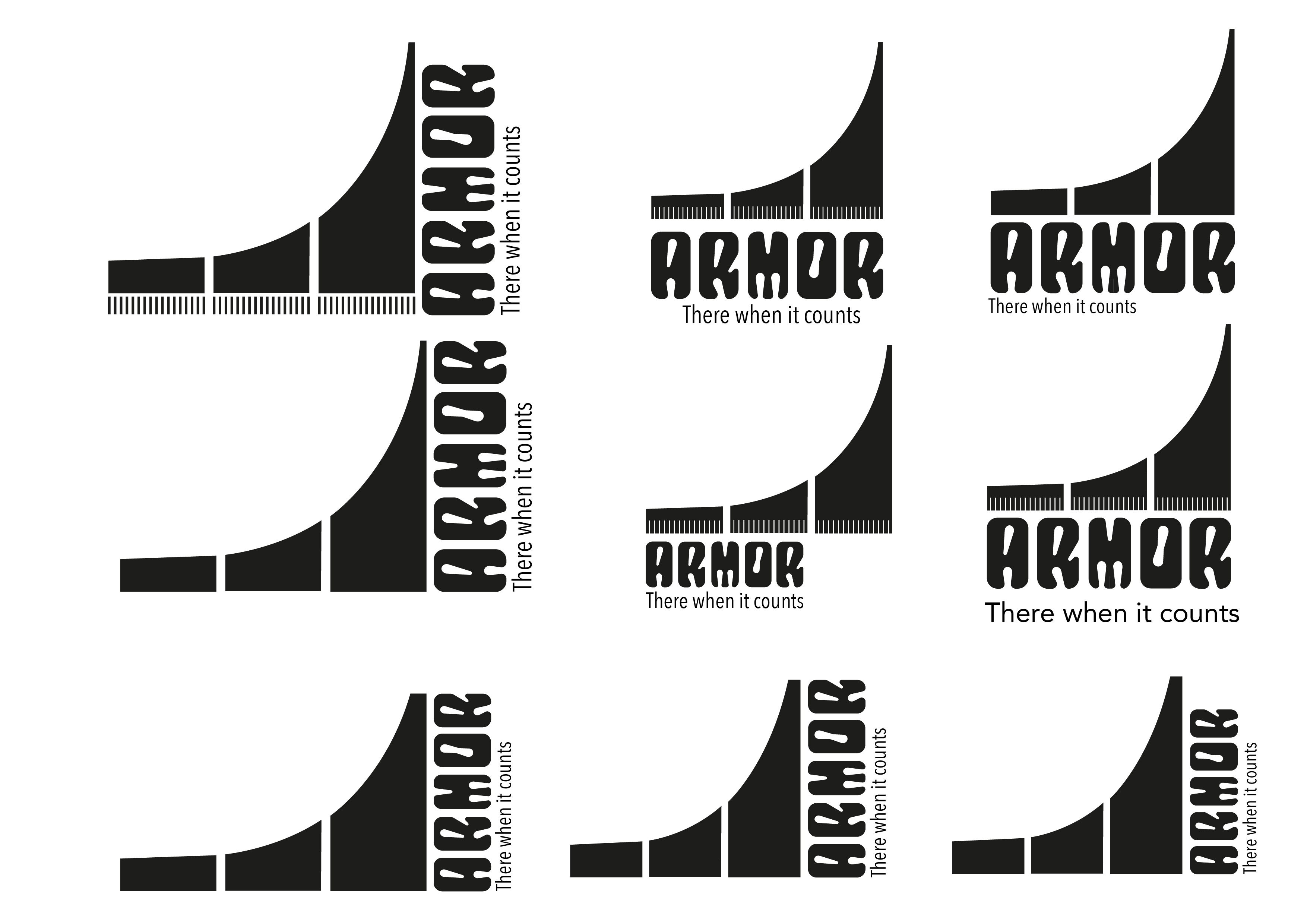
Process
Next project

previous project